We are always excited to develop new tools and solutions that help relieve the painful aspects of the testing. We’ve previously discussed responsive testing in our posts about incorporating Galen into Awetest and the importance of Responsive Design for E-Commerce. Now, we’re excited to introduce the Awetest Responsive Testing Utility (ARTU), for Breakpoint Testing. Anyone testing a responsive app/site will have to account for multiple breakpoints across a variety of devices, and the ARTU provides all the functionality necessary to do so on one page. Lets take a look at the features:
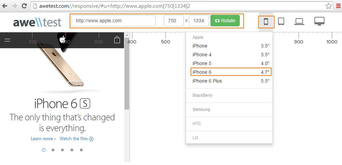
1. Predefined Breakpoints for Popular Devices
The ARTU gives you access to a library of predefined breakpoints for popular device types. These are broken out into four categories:
- Mobile: Apple, BlackBerry, Samsung, HTC, LG
- Tablet: Apple, Amazon, Asus, Barnes & Noble, HP, Microsoft, Samsung, Sony
- Laptop: Apple, Acer, Asus, Dell, HP, Lenovo, Sony Toshiba
- Desktop: Apple, Acer, Asus, Dell, HP, Lenovo, Sony
Once your breakpoint is selected, you can use the rotate button to select a portrait or landscape view.
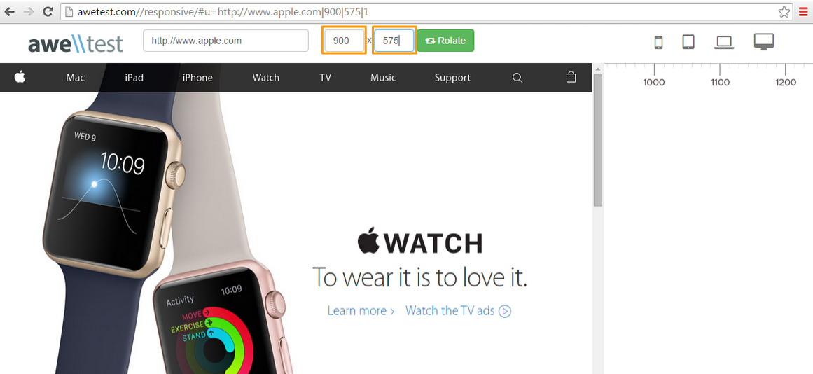
2. Custom Break Points:
If your breakpoint dimensions don’t fall under one of our predefined device breakpoints, you can set them to whatever you like. Either enter in the width and height, or use the drag and drop corner to meet your desired specs.
While we wouldn’t recommend ARTU for full-blown end-to-end testing of an application (we’d recommend exploring automation using the Galen Framework), ARTU is a very useful utility to conduct simple GUI tests for a specific view across multiple breakpoints, devices in a matter of seconds.


