30% of all US Commerce is now done on a mobile device; for a relatively new medium, that is an impressive rise that will only continue for the foreseeable future. It is also indicative of how necessary it is for E-Commerce sites to offer a mobile experience that is completely optimized for mobile devices. Mobile users are 5 times more likely to abandon their task if the site is not optimized for mobile, meaning your site better be mobile friendly!

Responsive Web Design
A website that has been optimized to offer a mobile experience is referred to as being responsive. The goal of designing a responsive site is to ensure that there is a fluid, intuitive user experience based on the device that the user is accessing the site through. With Google recently changing their search results ranking to prioritize mobile-friendly websites, and percentage of total responsive sites growing to 11%, Responsive Web Design’s popularity has only increased since its adoption.
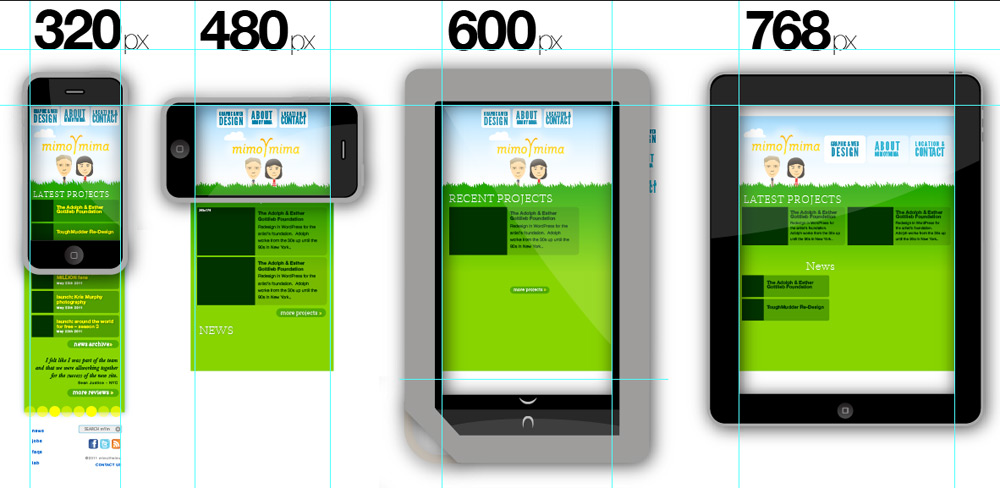
A core philosophy of RWD is that the layout of the site should fit the context it is being viewed within; for example, a desktop browser window will be able to contain more information and functionality than a mobile screen. These devices are defined by their responsive breakpoint, a word referring to the screen size that will dictate what version of the site the user will see. Responsive breakpoints are classified by the pixel width of the screen and can be defined a multitude of ways. Here some commonly used breakpoints:
- Full screen desktop website: 1024px
- Tablet browser: 720px
- Mobile browser: 320px
This allows for multiple versions of a single site to exist, with each different version optimized for a different breakpoint. An important point to note here is that these versions are united by the same URL, meaning there is no need to create a separate mobile or desktop site.
Device Prioritization
Sites are constantly changing and evolving; making sure every element is in place and functions as it should is necessary. We saw over 19,000 separate Android device models last year; this leaves an inordinate amount of variation to deal with when it comes to validating your website. In an ideal scenario, there is the time and money to test everything on every device; however, this is rarely the case. Much like functional testing for E-Commerce, a great way to start is by prioritizing your devices based on user distribution. If the top percentage of your users are on iPhones, spread the primary flows of your device testing across iPhones. This ensures that if any issues pop up, the majority of your userbase will be using a completely tested and functioning responsive application.
Using empirical data can be a great start when initially deciding what to test on. As of June 2015, these are the top selling smartphones in the world:
- iPhone 6
- iPhone 6+
- Samsung Galaxy S6
- Samsung Galaxy S6 Edge
- Apple iPhone 5S
If you were to build your testing around a statistic like this, you would have a safe scope of coverage; however, ensuring you are covering devices that are popular with your userbase is more often than not the best path to take.
Virtual vs. Real Devices
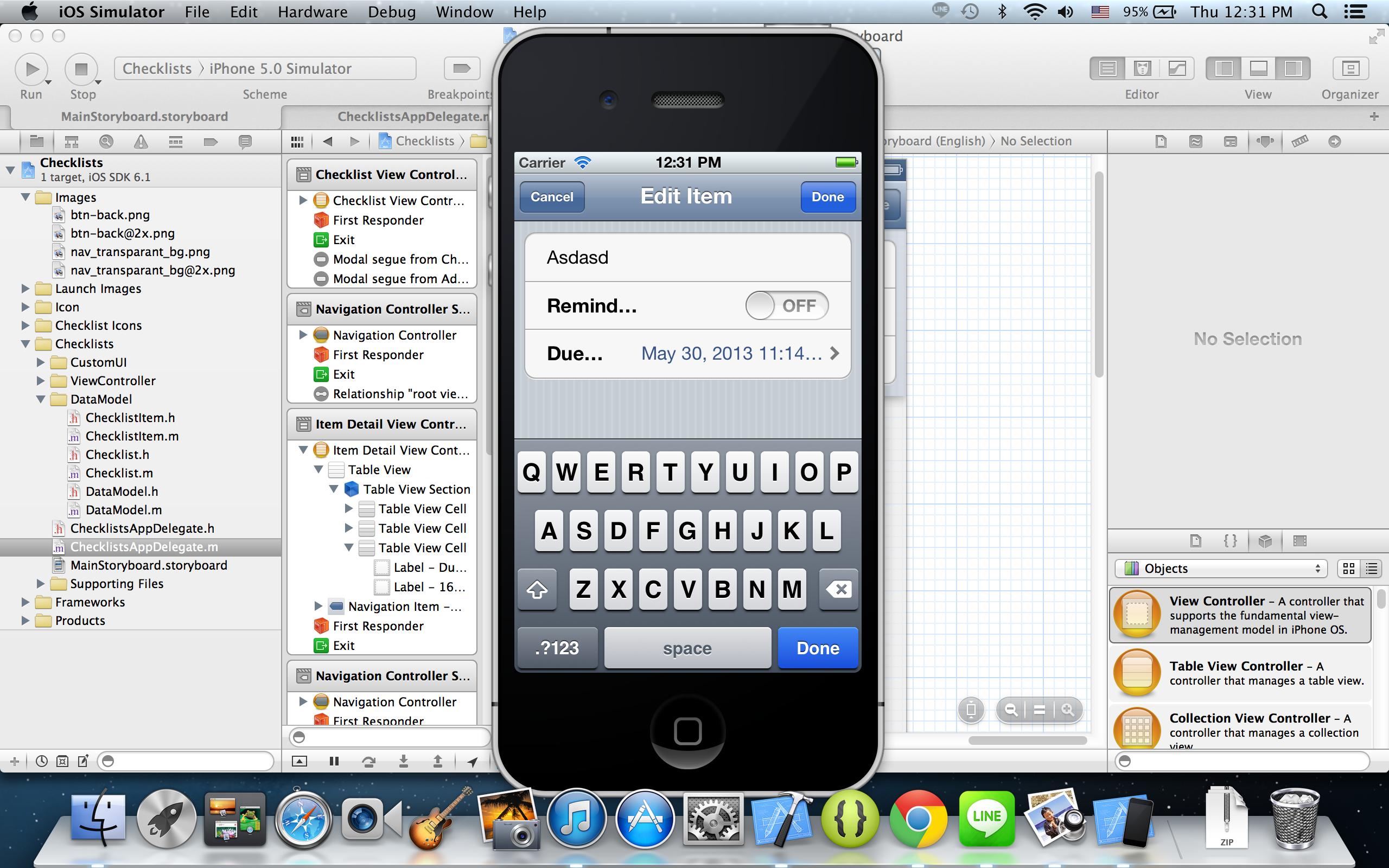
Emulators and VM’s are a popular solution to addressing a multitude of devices. As stated earlier, it is just not possible to hit every facet of every element in your site/app, and you will not always have access to every new and old device on the market. Emulators and VM’s are one solution to addressing the device issue. They can offer convenience in multiple ways:
- Ease of access across team members
- Low cost access to a library of devices (albeit emulated)
- Faster performance for certain cases (due to direct network connectivity)
However, VM’s can have performance issues and may paint an inaccurate picture of how exactly your site is behaving. Remember, your users will be using your app on an actual device, and while it may come close, an emulator cannot perfectly recreate that experience. Ensuring that validation is cross-checked with a real, physical device is important.
Consistency of Experience
Today, your shoppers are not going to consume your app/site exclusively via their phone; a transaction initiated on a smartphone can easily trigger an email that is read on a laptop, leading to a follow up visit on a tablet. As your user consume your app across these varied mediums/devices, there must be a consistent experience with usability, flow, and brand. 75% of mobile users in the US own a smartphone, and tablet ownership is currently higher than ever with 53% of Americans owning at least one. Chances are your users are actively using both, in conjunction with a personal computer. Engaging in responsive design offers more potential for a consistent experience right off the bat then creating a separate mobile site; you are shrinking down your familiar desktop experience, as opposed to creating a new mobile website from top to bottom. 90% of holiday shoppers expect consistency across their devices for a given brand, meaning creating and maintaining your unified experience is imperative.
Usability + Flow

All of us use our devices differently, and it is important to ensure we are testing our site/app while keeping in mind the variety of users representing our target audience. Deciding what to show at different breakpoints is where the majority of your decision making will be centered when it comes to responsive design. Simplifying certain messages/images/menus (or cutting them out entirely) should depend on what your goals for your different devices/breakpoints are. As each E-Commerce site and product offering differs, there is no set rule of what to choose when you are making these choices. Ideally, historical data should inform your decision making: features that users most commonly use, popular products that people who come to your site to buy, certain promotions that have worked in the past, etc. Another great way to do this is through A/B Testing, which at its core is simply comparing two versions of a website to determine the superior one.
We’d bet that your memorably enjoyable E-Commerce experiences have been (and will be) on a fully-functioning, responsively designed website. Proper testing of your site/app across devices and browsers will make sure that the experience is consistent and optimized for each platform. We have personally tested across a multitude of responsive sites, E-Commerce included, and found the most positive UX’s have been a result of error free builds. Feel free to let us know about your experiences with Responsive Web Design!