Everyone is aware that mobile is taking over the world- 55% of global internet usage is now happening on mobile devices. But what does that mean for website design? Should designers and developers be creating stand-alonemobile sites or implementing Responsive Design to have their current site work cross-platform?
We have a lot of experience with testing responsive applications. At 3Qi Labs we’re running 100,000+ tests in 1 hour (multi-threaded, of course) so we’ve seen the challenges our customers face with implementing Responsive Design, but the value proposition of moving to a Responsive architecture is also clear – single code base, reusable architecture components, lower maintenance overhead and consistent user experience to name a few.
Different applications call for different needs so this article offers information on what you can gain from Responsive Design, and what is needed to achieve it. The difficulties may outweigh the potential gains so it’s up to you to determine what is best for your specific app.
What’s Responsive Design?
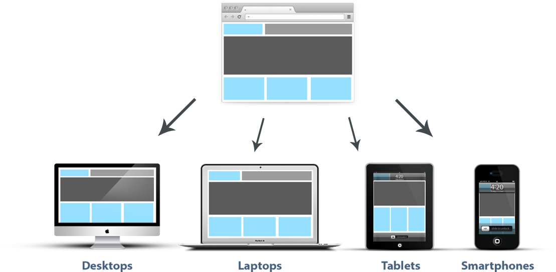
Simply put, this is when an application is designed to ‘respond’ to being accessed through different devices. A Responsive App renders a customized view for the device/form factor in which it is consumed. Developing Responsive Design isn’t a one-time effort; it’s an ongoing process to optimize UX.
Why is it important?
Because so many people are on mobile devices your website needs to be mobile friendly. It not only needs to look good, but it now needs to be usable cross-platform. Google found that 90% of people move between device screens to accomplish a goal, so your app needs to fluidly adapt to multiple screen sizes- and the solution to this is responsive design.
The alternative to responsive design is creating a separate mobile site (ex: http://m.website.com) specifically for the mobile experience, whereas with Responsive Design, both desktop and mobile run the same syntax, domain, and content. Below are comparisons between the two:
Mobile Site vs. Responsive Design
| Rendering | A mobile site is actually a new copy of your website that can be customized to render a specific mobile experience. | Your site picks up on screen specifications and adjusts according to the device’s screen size and orientation. |
| Future- Ready | Adjustments to the code might need to be made to stay current with new phones and mobile browsers. | No changes need to be made for future phones. |
| Link Equity |
Because they are separate sites, links shared from mobile browsers will not count for your primary site. | Link equity is preserved and doesn’t negatively affect the sharing of web addresses. |
| Domain Continuity | Having two sites can hurt search traffic and leads to you having two websites to manage. | You keep your domain so nothing changes except the back-end code. This avoids any complicated redirects. |
What Responsive Design Offers:
- Saves money. Although it will take more time to plan and develop, overall you now only have to develop one website. Creating a mobile app or mobile website isn’t necessary and that means there’s only one website that needs support! So this cuts down on web support costs.
- Saves time. As mentioned it takes more planning upfront, however this pays off in the long-run because after the initial development it will be much more time efficient for uploading new content and maintaining for future mobile devices.
- Saves effort. When updating your website it will be updated for every correct display and device, whereas with a mobile site it will need to be updated separately.
- Integration with SEO. With a single URL all of your links connect back to each other. This creates easier user interaction, a user on their phone can share your link to someone on a desktop with no issues, and it’s better for Google’s link algorithms.
What to Know Before Implementing Responsive Design:
- Higher initial costs and dev time. You need to be sure you’re willing to take that on before starting or you’ll be in for a shock. Don’t take on a responsive project without knowing what you’re doing.
- Slower downloads and increased load times. This can be a huge deterrent when deciding on responsive design. Because this isn’t a separate mobile site, your single responsive site has to load all elements on every device, and this can slow down downloads for things like images.
- You can’t customize your users’ Mobile experience. Content must be equally available on all OS and platforms, there is some content and elements that are more difficult to handle on mobile devices. You’ll have to learn how to deal with forms, tables, and navigation on every device.
Now you know what Responsive Design has to offer you, along with its fallbacks. No matter what your choice is, you need to do mobile testing, here are a few short strategies to follow when doing that. And if the pros outweigh the cons for your particular application then you should make the switch and try it out- and don’t forget to test cross-platform!